Price action is one of the most practical ways to understand the stock market. While many traders depend heavily on indicators, moving averages, or complex systems, price action brings attention back to the most important source of information on any chart: the price itself. Every candle, every swing, every breakout, and every rejection tells a story about buyers and sellers. When you learn how to read price action patterns in stock market charts, you begin to see that charts are not random. They reflect emotion, momentum, hesitation, fear, confidence, and shifting control between market participants.
For WordPress readers and website audiences, this topic is especially useful because it appeals to beginners, active traders, and even long-term investors who want a clearer understanding of chart behavior. Price action does not require expensive software or overly technical tools. It can be studied with a clean chart, a little patience, and a structured approach. Once you understand how patterns form, why they matter, and what they reveal, you can make better decisions about entries, exits, and market direction.
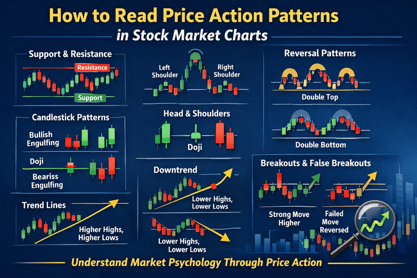
This guide explains how to read price action patterns in stock market charts in a simple and practical way. It covers the structure of price movement, the role of support and resistance, the meaning of candlestick behavior, and how to interpret common price action patterns in trending and sideways markets. The goal is not to predict every move perfectly. The goal is to develop a way of reading the market that is logical, repeatable, and grounded in actual price behavior.
What Price Action Means in the Stock Market
Price action refers to the movement of a stock’s price over time. It is the raw display of what buyers and sellers are doing in the market. When traders talk about price action, they usually mean studying chart movement without relying too much on lagging indicators. Instead of asking what an oscillator says, a price action trader asks what the price itself is showing.
Every market move begins with an imbalance between demand and supply. If buyers are stronger, price rises. If sellers dominate, price falls. If neither side is in control, the market moves sideways. Price action patterns form because these imbalances follow human behavior, and human behavior tends to repeat. That is why certain chart formations appear again and again across different time frames and across different stocks.
Reading price action is not about memorizing random shapes. It is about understanding the logic behind those shapes. A strong bullish candle after a sharp decline may show aggressive buying. A failed breakout may reveal that buyers lacked conviction. A series of higher lows may show that demand is gradually increasing even before a big move happens. Once you begin to connect the pattern to the psychology behind it, price action becomes much easier to understand.
Price Action Pattern Checker
Select a chart condition and see what it usually suggests in price action analysis.
Why Price Action Matters More Than Just Indicators
Indicators can be useful, but they are built from price. That means price comes first and indicators come later. If a trader relies only on indicators, they may miss the early signs of a move. Price action gives a more direct reading of what the market is doing right now.
This does not mean indicators are useless. It simply means price action should come first. A trader who can read the chart directly is often better prepared to spot early reversals, continuation moves, false breakouts, and changes in momentum. In many cases, price action provides the context that indicators alone cannot.
For example, a stock may appear overbought on an indicator, but if price is breaking out from a long consolidation with strong candles and rising volume, that so-called overbought condition may actually be a sign of strength. Similarly, an indicator may look neutral while price is repeatedly failing to move above resistance, showing hidden weakness. Price action helps you see the structure behind the signal.
Understanding the Basic Structure of a Stock Chart
Before reading patterns, you need to understand the structure of a chart. A stock chart is not just a collection of candles. It is a visual map of trend, momentum, and reaction levels.
The first thing to identify is whether the stock is in an uptrend, downtrend, or range. In an uptrend, price makes higher highs and higher lows. In a downtrend, price makes lower highs and lower lows. In a range, price moves between support and resistance without establishing a clear direction.
The second thing to study is swing behavior. Swing highs and swing lows are important because they show where price changed direction. These turning points help define trend structure. If price breaks above a previous swing high in a healthy uptrend, that often confirms bullish strength. If it breaks below a key swing low, that may signal weakness or a trend shift.
The third part of chart structure is the candle itself. Candlesticks show the open, high, low, and close of a session. Their size, shape, and location can reveal momentum and intent. A long bullish candle closing near its high often suggests strong buying. A candle with a long upper wick may show rejection from higher levels. When read in context, candles become one of the most important parts of price action analysis.
The Role of Support and Resistance in Price Action
Support and resistance are central to reading price action patterns in stock market charts. Support is an area where price tends to find buying interest. Resistance is an area where price tends to face selling pressure. These levels are not always exact prices. They are often zones where market behavior changes.
Support works because traders see value at lower levels, or because previous sellers start buying back their positions. Resistance works because traders book profits, hesitate to buy at higher prices, or initiate short positions. Since many participants watch these same areas, they often become self-reinforcing.
Price action becomes more meaningful near support and resistance. A bullish reversal candle at support carries more value than the same candle in the middle of a random range. A breakout above resistance with strong follow-through means more than a small move above a level that immediately fails. The location of the pattern matters as much as the pattern itself.
A good chart reader does not simply draw lines and assume they will hold forever. They watch how price behaves around these zones. If price touches support and bounces sharply, that suggests strength. If it keeps revisiting support and bouncing less each time, that can signal weakening demand. The same logic applies to resistance. Repeated tests of resistance may lead to a breakout if sellers begin to lose control.
How Candlestick Behavior Helps Read Price Action
Candlestick reading is a major part of price action analysis. Each candle shows a small battle between buyers and sellers. The size of the candle body, the length of the wicks, and the closing position all matter.
A strong bullish candle usually has a wide body and closes near the high of the session. This suggests buyers were in control from open to close. A strong bearish candle has the opposite structure and shows selling pressure. Small candles often reflect hesitation or balance between both sides.
Wicks also tell an important story. A long lower wick shows that sellers pushed price down but buyers stepped in and forced a recovery. A long upper wick shows that buyers tried to push higher but sellers rejected the move. When these candles appear at key levels, they often hint at reversal potential.
However, one candle alone is not enough. Price action works best when you read candles as part of a larger pattern. A bullish candle after a prolonged decline near support has more importance than the same candle after an already extended rally. Context gives meaning to candlestick behavior.
Reading Trend Continuation Patterns
Some price action patterns suggest that the current trend is likely to continue. These continuation patterns are common in strong markets because price rarely moves in a straight line. Even in a strong uptrend, stocks pause, consolidate, and then move again.
One common continuation structure is the pullback in an uptrend. In this case, the stock rallies, then retraces modestly without breaking the previous trend structure, and then resumes moving higher. The pullback often forms small bearish candles or a tight range, showing that selling pressure is limited. When price breaks above the pullback high, it may signal trend continuation.
Another continuation pattern is the flag. A bullish flag forms after a sharp upward move, followed by a short downward-sloping or sideways consolidation. This pattern suggests that the market is resting, not reversing. If price breaks upward from the flag with momentum, the uptrend may continue.
A similar idea applies in downtrends. A stock may fall sharply, then pause in a small upward drift or sideways range. This can form a bearish flag. If price breaks below the consolidation, it may continue lower. These patterns work because they show that the countertrend move lacks conviction while the dominant trend remains intact.
To read these patterns properly, traders should focus on depth and quality of the pullback. A shallow, orderly pullback in a strong trend often signals strength. A deep and chaotic pullback can suggest that the trend is weakening.
Reading Reversal Patterns in Stock Market Charts
Reversal patterns are among the most watched price action formations because they may indicate that the current trend is ending. However, traders should be careful. Many apparent reversals are only temporary pauses. That is why context and confirmation are important.
One classic reversal structure is the double top. This happens when price rises to a certain level, retreats, and then returns to the same area but fails to break higher. The second rejection suggests that resistance is holding and buyers are losing strength. If price then falls below the intermediate low between the two peaks, the pattern becomes more meaningful.
The opposite is the double bottom. Price falls, bounces, returns to the same low area, and then holds again. This suggests that support is being defended. A breakout above the intermediate high strengthens the reversal case.
Head and shoulders is another widely known reversal pattern. In a bearish version, price forms a left shoulder, then a higher peak called the head, and then a lower peak called the right shoulder. When price breaks below the neckline, it may signal a shift from bullish to bearish control. The inverse head and shoulders works in the opposite direction and can mark a bullish reversal after a decline.
These patterns are useful because they show repeated failure by the dominant side. In a double top, buyers fail twice. In head and shoulders, each upward push loses force. The pattern itself is important, but the underlying message is even more important: control is shifting.
How to Identify Breakouts and False Breakouts
Breakouts are a major part of price action trading. A breakout happens when price moves above resistance or below support with enough strength to suggest a new directional move. Strong breakouts often come after consolidation because the market has stored energy during the range.
A healthy breakout usually has a clear close beyond the level and follow-through in the next candles. It often occurs with expanding volume, though volume alone should not be the only filter. The candle should show commitment rather than hesitation. A breakout candle that closes near its high is often stronger than one that barely closes above the level with a long upper wick.
False breakouts are equally important. These happen when price briefly moves beyond support or resistance but quickly returns inside the range. False breakouts trap traders who entered too early and often lead to sharp moves in the opposite direction.
For example, if a stock breaks above resistance but immediately falls back below it, that may indicate that the breakout lacked real demand. In some cases, false breakouts can become powerful reversal signals because trapped buyers rush to exit. Reading breakouts well requires patience. It is often better to wait for confirmation than to chase the first move.
The Importance of Market Context
No price action pattern should be read in isolation. The same pattern can mean different things in different contexts. A bullish engulfing candle at long-term support after a deep correction may carry strong reversal potential. The same candle inside a choppy sideways market may mean very little.
Market context includes the broader trend, the location of the pattern, recent momentum, and the overall structure of the chart. It also includes the time frame. A reversal pattern on a weekly chart usually matters more than a small intraday reversal on a five-minute chart. Larger time frames tend to carry more weight because they reflect a bigger pool of market participation.
Traders should also consider whether the stock is leading or lagging the sector and the broader market. A strong-looking bullish pattern in a weak stock may fail if market conditions are deteriorating. Context helps filter out low-quality setups and improves decision-making.
How Volume Supports Price Action Reading
Although price action focuses primarily on price, volume often adds useful confirmation. Volume shows participation. When price breaks out with strong volume, it suggests that more traders are involved in the move. When price rises on low volume, the move may be less reliable.
At reversal points, volume can also offer clues. A large bullish candle at support with heavy volume may signal strong accumulation. A breakdown below support with rising volume may suggest real distribution rather than a temporary dip. Still, volume should support price action, not override it. Price remains the primary source of information.
In some modern trading environments, especially with algorithmic activity, volume can be noisy. Even so, unusual spikes in volume around important chart levels still deserve attention. When price and volume align, the pattern often becomes more trustworthy.
Common Mistakes When Reading Price Action Patterns
One of the biggest mistakes traders make is forcing patterns onto charts. Not every fluctuation is a valid setup. When someone is too eager to trade, they begin to see head and shoulders, flags, and reversals everywhere. Good price action reading requires patience and selectivity.
Another mistake is ignoring trend. Traders sometimes try to short every resistance touch in a powerful uptrend or buy every support level in a strong downtrend. The market often rewards traders who align with the prevailing structure rather than constantly betting against it.
A third mistake is entering before confirmation. Just because a stock approaches support does not mean it will bounce. Just because it nears resistance does not mean it will fall. Waiting for actual price behavior, such as rejection candles, a break of structure, or sustained follow-through, can improve the quality of trades.
Many traders also fail because they ignore risk management. Even the best price action pattern can fail. No setup works all the time. That is why reading the chart should always be paired with controlled position sizing and a clear invalidation level.
How Beginners Can Practice Reading Price Action
The best way to learn price action is through repeated chart study. Open charts of well-known stocks and review how they behaved around important support and resistance levels. Look at major trend moves, pullbacks, reversals, and breakout attempts. Notice how candles behaved before and after each move.
It is helpful to mark swing highs and lows, identify trend direction, and describe what the market was doing in plain language. Instead of saying only that a stock formed a pattern, say what the buyers and sellers were communicating. This builds deeper understanding.
Beginners should start with clean charts. Too many indicators can distract from the core story. Once you become comfortable reading structure, you can add a few tools if they help, but price should remain the main focus.
It is also wise to study multiple time frames. A daily chart may show the larger trend, while a shorter chart may help refine entry. This top-down view allows traders to stay aligned with the broader structure while still finding precise setups.
Conclusion
Learning how to read price action patterns in stock market charts is one of the most valuable skills a trader or investor can develop. It helps you move beyond guesswork and understand the real language of the market. Price action shows whether buyers are confident, whether sellers are defending a level, whether momentum is building, or whether a move is losing strength.
The real power of price action lies in its simplicity. You do not need dozens of indicators to understand what a chart is saying. You need a solid grasp of trend, support and resistance, candlestick behavior, and pattern context. With practice, you begin to see that charts reflect repeated human behavior, and that behavior leaves clues.