Financial Astrology by Rajeev Prakash
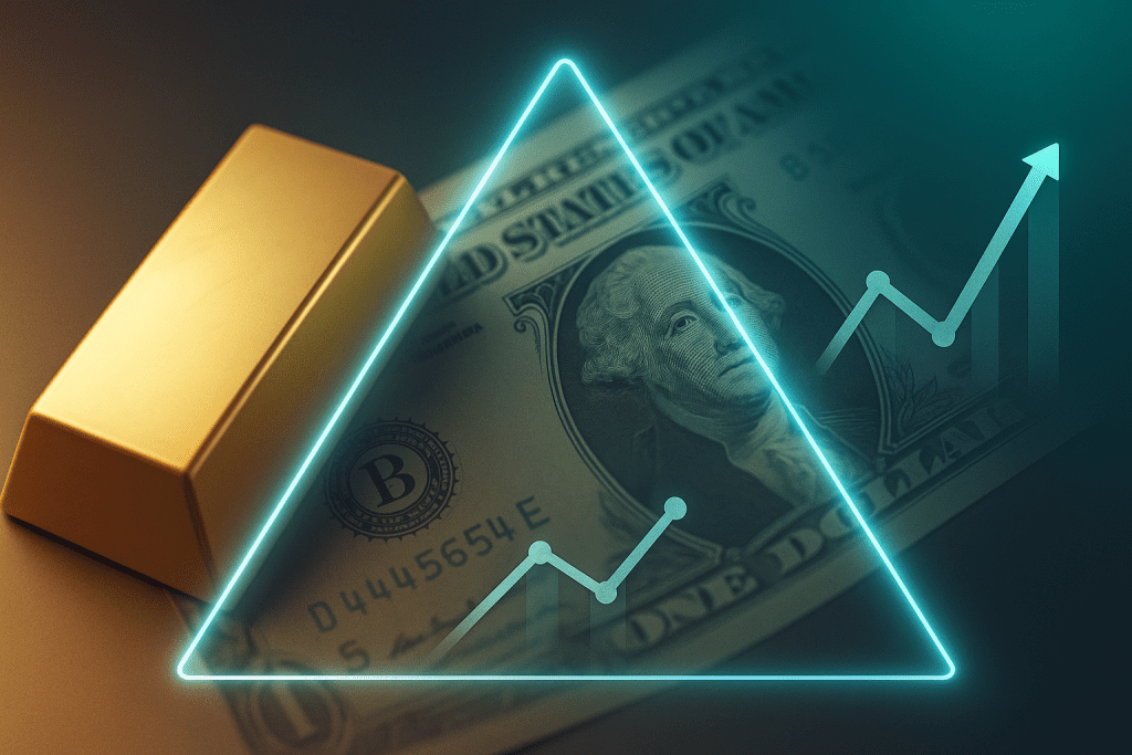
Gold, the US dollar, and bond yields form an invisible triangle that quietly shapes every major move in global markets. When gold explodes higher or suddenly breaks down, the real story is usually hidden in the behaviour of the US Dollar Index and the US 10-year Treasury yield.
Gold does not move in isolation. Behind every sharp rally or sudden drop in gold, there is almost always a story playing out in the US dollar and bond yields. Together, gold, the US Dollar Index (DXY), and the US 10-year Treasury yield form a powerful macro triangle that shapes sentiment, liquidity, and risk-taking across global markets.
This page is designed to help traders and investors understand that triangle in a clear, practical way. Instead of treating gold as just another chart, you will see how gold reacts to changes in the dollar and yields, how different macro regimes emerge, and how you can use the tools on this page to anticipate turning points rather than simply reacting to them.
Here you will learn the logic behind the relationships, and you will also see how the Tri-Axis Chart, Pivot Alert Calculator, Explainer Video, and Quiz Widget reinforce that logic in real time. The goal is simple. When you look at gold after going through this page, you should automatically ask what the dollar and yields are doing, and whether the current move in gold fits the historical pattern or is signalling a new regime.
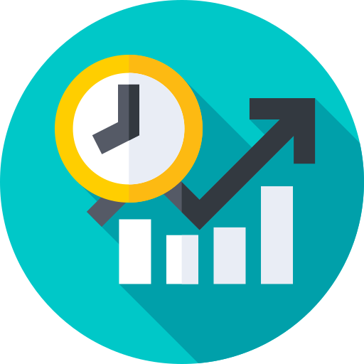
Why Bond Yields Matter For Gold
Bond yields, especially the 10-year US Treasury yield, are the market’s core signal about growth, inflation, and monetary policy expectations over the medium term. For gold, the most important concept is that of real yields, which are nominal yields adjusted for inflation.
Gold is sometimes described as a zero-yield asset. That description is mechanically true but incomplete. The real question is how gold compares to the return available in safe government bonds after inflation.
When real yields are rising and comfortably positive, investors can earn a decent real return in Treasuries and other high-grade bonds. In such an environment, holding gold comes with a higher opportunity cost. This often coincides with pressure on gold prices or at least with headwinds that limit sustained rallies.
When real yields fall, especially when they drop below zero, the picture reverses. Cash and high-grade bonds may no longer preserve purchasing power after inflation. At that point, the appeal of gold as a store of value tends to increase. In those regimes, even modest dollar weakness can combine with falling real yields to produce strong gold uptrends.
You will notice on the Tri-Axis Chart that some of the most important gold moves occur near turning points in yields. Tops and bottoms in the 10-year yield often align with trend changes in gold. Some of those turning points are subtle when looking at a single chart, but they become far clearer when yield is plotted alongside gold and DXY.
Understanding Gold As A Macro Asset
Gold is far more than a shiny metal. In modern markets, it functions as a store of value, a hedge against currency debasement, a barometer of fear, and a diversification tool inside institutional portfolios.
Start your journey to financial
Unlike equities that represent ownership in a business or bonds that pay coupons, gold does not generate cash flow. That simple fact is at the centre of its relationship with interest rates and yields. When real yields are low or negative, the opportunity cost of holding gold is modest, so investors are more willing to allocate to it. When real yields move sharply higher, investors can earn more from safe bonds, which often reduces the appeal of holding a non-yielding asset like gold.
The Role Of The US Dollar Index (DXY)
The US Dollar Index, commonly referred to as DXY, measures the strength of the dollar against a weighted basket of major currencies. Since gold is primarily traded and quoted in dollars, DXY acts like a second axis underneath the gold chart.
When the dollar appreciates, each ounce of gold becomes more expensive in foreign currencies. For buyers in Europe, the United Kingdom, Japan, or emerging markets, this can feel like a double squeeze: they pay more in their local currency, even if the dollar price of gold is unchanged. As a result, strong rallies in DXY often coincide with downward pressure on gold or at least with headwinds that make further gold rallies harder.
When the dollar weakens, foreign buyers can obtain gold at a relatively cheaper local price, which can support demand. In such periods, you often see gold rising alongside a softening dollar, especially if there is a supportive story around inflation, central bank dovishness, or risk hedging.
However, the relationship is not static. During periods of global risk aversion, there are episodes where both the dollar and gold rise together. In those cases, investors rush into the dollar as the world’s reserve currency and into gold as a crisis hedge. The important point for your readers is that they must always interpret gold through the combined lens of DXY and yields rather than looking at any one factor in isolation.
Why Bond Yields Matter For Gold
Bond yields, especially the US 10-year Treasury yield, are the market’s real-time verdict on growth, inflation, and monetary policy expectations. For gold, the crucial concept is real yields, which are nominal yields adjusted for inflation expectations.
Reading The Gold–Dollar–Yield Triangle
The gold–dollar–yield triangle is a mental model with three corners. One corner is gold. The second corner is the US Dollar Index. The third corner is the 10-year yield and, by extension, real yields. Market regimes can be described as different alignments of these three corners.
Building The “Gold vs Dollar vs Yields” Experience On WordPress
Gold has played different roles over time. In the era of the gold standard it was money itself. In the modern fiat era, it has evolved into a portfolio hedge, a long-term store of value, and a crisis barometer. Unlike a stock, gold does not represent ownership in a company. Unlike a bond, it does not pay interest. Its value depends on what investors are willing to pay for a scarce asset that is nobody’s liability.
This absence of yield is crucial. Because gold does not pay coupons or dividends, investors always compare it against assets that do. When interest rates and bond yields rise meaningfully above inflation, the opportunity cost of holding gold increases. When yields fall or turn negative in real terms, that opportunity cost fades and gold becomes relatively more attractive.
The Tri-Axis Chart: Gold, DXY, And 10-Year Yield On One Screen
Gold is also priced in US dollars on the global stage. A trader in Europe, Asia, or the Middle East is constantly translating the gold price into local currency terms. When the dollar strengthens, gold becomes more expensive in those currencies even if the dollar price is unchanged. When the dollar weakens, foreign buyers can acquire more gold for the same amount of local money.
Beyond yield and currency, gold responds to confidence. When markets fear inflation, policy mistakes, financial crises, or currency debasement, gold tends to benefit as investors look for assets that are not tied to any single government or central bank. When confidence is high, yields are positive in real terms, and policy is predictable, the urgency to own gold often fades.
Throughout this page, you will see gold treated not as a mystical safe haven, but as a rational macro asset that lives at the intersection of real yields, currency strength, and risk perception.
Explaining The Correlation Toggle On The Tri-Axis Chart
A key feature of your Tri-Axis Chart is the correlation toggle. This gives users the ability to see not just the price levels of gold, DXY, and yields, but also how closely they have moved together over a chosen period.
In your content, explain that when a user turns on the correlation view, the chart calculates a rolling correlation between gold and DXY, and between gold and yields, over a selected window such as thirty days or ninety days. The correlation ranges from negative one to positive one.
The US Dollar Index tracks the value of the dollar against a basket of major currencies. Because gold is quoted in dollars, DXY quietly influences every tick of the gold chart. For a non-US investor, the true cost of gold is a combination of the dollar price and the local currency’s strength or weakness against the dollar.
Practical Ways To Use The Tri-Axis Chart
When DXY is rising, the dollar is gaining strength. For foreign buyers, this means that each ounce of gold costs more local currency. Demand can soften in those regions, and global flows into gold may cool. In many historical periods, a strong dollar has been associated with weaker or capped gold prices, especially when rising DXY is accompanied by higher yields.
When DXY is falling, the reverse is true. Gold becomes more affordable in local currency terms outside the United States. Combined with falling real yields or rising inflation concerns, a weaker dollar can support powerful rallies in gold.
It is important to note that the relationship is not always simple. There are episodes when both the dollar and gold rise together. This tends to happen during intense risk aversion, when investors seek both the world’s reserve currency and a neutral store of value. There are also periods when the dollar drifts sideways while gold responds more to changes in yields and inflation expectations.
On this page you will see DXY as one corner of the triangle. When you study the Tri-Axis Chart, watch how often major gold turning points coincide with inflections in the dollar. You will begin to see that gold’s story is incomplete without DXY.
The Gold–Dollar–Yield Triangle In Practice
Gold, DXY, and yields do not move in perfect lockstep. Instead, they form regimes. In one regime, the dollar is strong, yields are rising, and gold is under pressure. In another regime, the dollar is soft, real yields are falling, and gold is trending upward. There are also transitional regimes, where relationships temporarily break down, correlations weaken, and traders are forced to reassess.
Think of the gold–dollar–yield triangle as a map of macro weather conditions. A strong dollar combined with rising real yields creates a headwind for gold. A weak dollar combined with falling real yields creates a tailwind. Periods of extreme risk aversion can pull both the dollar and gold higher while yields fall. Periods of speculative exuberance can drive yields up, push the dollar sideways, and leave gold range-bound until the narrative changes again.
On this page, the tools you see are built around this triangle. The Tri-Axis Chart lets you visualise the regime. The Pivot Alert Calculator helps you translate yield expectations into potential gold scenarios. The Explainer Video tells the story of why these forces matter, and the Quiz Widget helps you train your eye to recognise these regimes in real data.
The Tri-Axis Chart: Gold, DXY, And The 10-Year Yield On One Screen
The Tri-Axis Chart is the visual centrepiece of the “Gold vs Dollar vs Yields” section. Instead of forcing you to jump between three separate charts, it brings gold, DXY, and the 10-year yield into a single view.
On this chart, gold acts as the anchor. The US Dollar Index is plotted alongside it to show how currency strength is evolving, and the 10-year yield is added to reveal how the bond market’s expectations are shifting. Scales are adjusted so that the three lines remain readable and you can see patterns rather than getting lost in the absolute levels.
By default, you can view multiple time frames. Shorter windows highlight intraday and short-term interactions around data releases, central bank meetings, and risk events. Longer windows reveal slow-moving cycles in which yields rise or fall over months, the dollar trends gradually, and gold forms major bases or tops.
The purpose of this chart is not to provide a perfect statistical model, but to give you a clear visual narrative. When all three lines are moving together in a familiar pattern, the regime is well-defined. When the relationships start to diverge, the chart gives you early hints that the macro weather is changing.
Meet Our Team
Get to know our dedicated team of experts. With a diverse range of skills and years of experience, we’re committed to providing you with the best market analysis and investment guidance.

Mr. Rajeev Prakash Agarwal
Founder
Expert in financial & personal astrology for 20 years+. Rajeev is a well-known astrologer based in central India who has a deep understanding of both personal and mundane astrology.

Mr. Shashi Prakash Agarwal
Technical Head
Shashi is a technology leader with a strong background in global business.He holds a B. Tech in Computer Science & MBA in Finance from Narsee Monjee Institute of Management Studies, one of the top B-Schools in India.
How To Read The Tri-Axis Chart
As you spend time with the Tri-Axis Chart, certain patterns will begin to stand out. You will see periods when DXY moves steadily higher, yields grind up, and gold struggles to make progress. You will also see episodes when yields peak, start to roll over, and the dollar loses momentum while gold quietly carves out a base.
Reading the chart begins with a simple habit. When you see a move in gold, glance immediately at what the dollar and yields are doing at the same time. If gold is falling and you notice that yields have spiked higher while DXY is firm, the move is consistent with the classic headwind regime. If gold is rallying and you see that yields are dropping and DXY is weakening, the rally is consistent with the classic tailwind regime.
The most interesting moments are when gold moves against the usual pattern. If gold sells off even though yields are falling and the dollar is weak, it may signal a temporary dislocation or a shift in narrative. If gold rallies while yields rise and the dollar is strong, it may indicate intense risk aversion or a deeper fear of systemic stress.
The Tri-Axis Chart turns these interpretations from vague guesses into concrete observations. Over time, by watching real data rather than just reading theory, your ability to recognise meaningful deviations and confirm high-probability setups improves dramatically.
Why Choose Us ?
Astrodunia guides you through the market’s ups and downs with the help of planetary science. Our team of experts in financial astrology provide valuable insights and predictions to assist you in market wise investment decisions and navigate the global market with ease.
Market Forecasting
Experience the advantage of enhanced market predictions. Our unique approach combines traditional analysis with astrological insights for more accurate predictions and better investment opportunities.

Decades of Market Timing Expertise
For over 20 years, we’ve honed our skills in market timing within the stock market. Our extensive experience allows us to navigate market trends with precision and confidence.

Trusted by Discerning Investors
Our clients choose us for our proven track record of success and our commitment to providing them with the most reliable market insights. Join the ranks of satisfied investors who trust our expertise
Correlation Toggle: Seeing Relationships Change In Real Time
Beneath the visual patterns, there is another layer of information that matters. This is the strength of the relationship between gold and DXY, and between gold and yields. The correlation toggle on the Tri-Axis Chart brings that layer to the surface.
When you activate the correlation view, the chart calculates rolling correlations between gold and DXY, and between gold and yields, over a selected window. You will see how tightly these assets have moved together or in opposition over that period.
A strong negative correlation between gold and DXY means that gold has typically moved opposite to the dollar. A strong negative correlation between gold and real yields means that gold has often rallied when yields fell and retreated when yields rose. Correlations close to zero signal that the relationships have been loose and unreliable for trading decisions.
Watching correlations change can be as informative as watching price. A regime shift often begins with a gradual weakening of previously strong relationships. The correlation toggle helps you see when the market is transitioning from one environment to another, even before price patterns fully reflect the change.
This feature is particularly useful for traders who depend on macro overlays for risk management. If you have a position in gold that assumes a certain relationship with yields or the dollar, and you see that relationship decaying, it may be time to reduce size, hedge, or reassess the thesis.
Pivot Alert Calculator: Turning Yield Moves Into Gold Scenarios
The Pivot Alert Calculator is the second core tool on this page. While the Tri-Axis Chart tells you what has been happening, the calculator helps you explore what could happen under different yield scenarios.
The basic idea is straightforward. The calculator looks at the historical sensitivity of gold to changes in yields over a chosen lookback period. Using that relationship, it translates an expected move in the 10-year yield into a projected range of possible outcomes for gold.
When you open the calculator, you specify the current yield, your expected change in yield, and the horizon you are interested in. The tool then applies its sensitivity estimate to generate an indicative gold range that aligns with similar moves in the past. It does not try to predict the exact future price. Instead, it gives you a range that reflects how gold has behaved historically under comparable yield shifts.
This moves you from vague assumptions to quantified scenarios. Instead of saying that higher yields may hurt gold at some point, you can work with a range that helps you choose position size, stop levels, and profit targets with more discipline.
Whether you’re a seasoned investor or just starting out, our financial astrology tools can be tailored to your specific investment goals. Gain valuable insights to achieve your financial aspirations.
Address
1301, 13th Floor, Skye Corporate Park, Near Satya Sai Square, AB Road, Indore 452010
+91 9669919000
© All Rights Reserved by RajeevPrakash.com (Managed by AstroQ AI Private Limited) – 2025