A stock heat map is an essential visual tool for both novice and experienced investors, providing a quick and intuitive way to analyze the market’s performance. By using color-coded rectangles, it represents how individual stocks or entire sectors perform on a given day. The size of the rectangle typically reflects the market capitalization of a stock, and the color—ranging from deep red to bright green—shows whether the stock’s price is decreasing or increasing.
In this article, we will explore the importance of stock heat maps, how they function, and the specific benefits they offer investors.
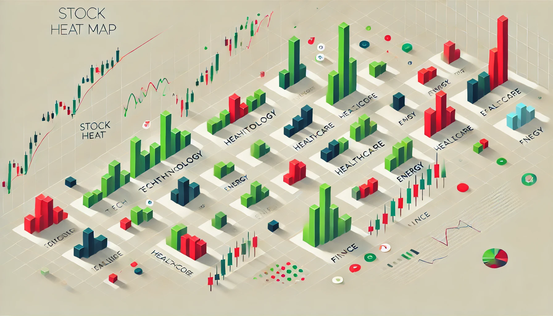
1. What is a Stock Heat Map?
A stock heat map is essentially a graphical representation of the stock market. It’s designed to give investors a broad snapshot of how different stocks, sectors, or indices are performing throughout the trading day. Instead of scanning through numerous charts or tables, investors can quickly assess the overall market sentiment.
The color coding is crucial:
- Green indicates that a stock or sector is gaining value.
- Red signifies a loss in value.
- Dark green or dark red shades highlight the most significant movements, whereas lighter shades suggest more moderate changes.
By adjusting the color intensity based on performance, the heat map makes it easier to identify which stocks or sectors are doing well and which are underperforming.
2. How Stock Heat Maps Work
The layout of a stock heat map is based on a hierarchical structure, often grouped by sectors, industries, or individual stocks within an index (e.g., S&P 500, Nasdaq). Larger market cap companies will occupy bigger rectangles, while smaller companies will be visually smaller.
A typical stock heat map will have the following structure:
- Stock or sector size: The size of each block is proportional to the company’s market capitalization.
- Color intensity: The color scale helps investors immediately identify big winners and losers of the day.
For example, if the Technology sector is performing well on a particular day, it might appear in deep green, and stocks like Apple or Microsoft might occupy larger spaces with a vibrant green hue due to their massive market capitalizations and price gains.
3. Key Benefits of Using Stock Heat Maps
a. Quick Market Overview
The primary benefit of using a stock heat map is that it allows investors to get a snapshot of the market in just a glance. By looking at the colors and sizes of the rectangles, you can immediately assess the overall sentiment of the market and identify major trends.
b. Sector and Stock Comparison
Stock heat maps are particularly useful for comparing different sectors or stocks within the same industry. You can easily see whether the entire sector is moving in one direction or if there’s divergence among individual stocks. For example, in the Energy sector, you may find a mix of greens and reds, indicating that while oil prices are rising, certain renewable energy stocks may be underperforming.
c. Identifying Key Market Movers
With heat maps, you can easily spot the major market movers. Large companies that significantly affect the market, like Amazon, Tesla, or Nvidia, can be identified through their large block size and the intensity of their color. This feature is beneficial for investors looking to follow the stocks that drive market movement.
d. Time-Efficiency
Instead of manually going through individual stock charts or tables, heat maps provide a time-efficient way to keep track of a wide range of stocks or sectors. This allows investors to quickly zero in on key areas of interest without sifting through endless data.
e. Trend Spotting
Heat maps also help in spotting emerging market trends. For example, if multiple companies in a specific sector like Healthcare or Technology are all trading in the green, it could indicate a larger trend or growth pattern in that industry. Conversely, if a heat map shows many red blocks in the Retail or Automotive sectors, it may signal market pessimism or industry-specific challenges.
4. Common Uses of Stock Heat Maps
a. Day Trading
Day traders use stock heat maps to identify stocks with significant price movements, especially those that exhibit large percentage changes in a single trading day. This helps them capitalize on short-term volatility and make quick trading decisions.
b. Sector Rotation Strategies
For long-term investors or those who employ sector rotation strategies, stock heat maps are essential in tracking sector performance. When one sector consistently outperforms others, some investors may shift their portfolio allocations toward that sector to take advantage of rising trends.
c. Portfolio Analysis
Stock heat maps can also be a useful tool for portfolio analysis. Investors can compare their portfolio holdings against the overall market or sector performance. This comparison provides insight into how well their stocks are performing relative to the market, helping to identify potential underperformers that may need to be reassessed.
5. Popular Stock Heat Map Platforms
There are several platforms that provide stock heat map tools, each offering different customization options for users. Some of the most popular platforms include:
- Finviz: A widely-used heat map tool that covers U.S. and international stocks, grouped by market cap or sector. It offers custom settings, including time intervals and performance metrics.
- Yahoo Finance: Offers a heat map that covers various sectors and allows investors to track the real-time performance of stocks and indices.
- TradingView: Known for its wide range of charting tools, TradingView also provides a heat map feature that helps investors track global stocks and sectors.
These platforms allow you to customize your view based on your investment focus, be it sectors, market cap, or individual stocks.
Conclusion: The Power of Stock Heat Maps
Stock heat maps have revolutionized the way investors monitor and analyze the market. With their ability to display a wealth of information in a simple, visual format, they provide significant value to both novice and experienced traders. Whether you’re a day trader looking for quick opportunities or a long-term investor tracking sector trends, stock heat maps are an essential tool for efficient market analysis.
For investors seeking even more sophisticated insights and timing strategies, expert tools such as those available at rajeevprakash.com can complement the use of heat maps, helping you make data-driven decisions in an ever-evolving market.